Building a Compose Widget Using Jetpack Glance
Stay hydrated
Recently, Android has announced the Alpha release for Jetpack Glance, a widget-building framework built on top of Jetpack Compose.
With the release of Android 12, app widgets have received a revamp to drastically improve both developer and user experience.
As such, Glance provides a convenient, streamlined way to create widgets with far less code. The framework provides a base set of composables that can be leveraged to create beautiful and functional user experiences.
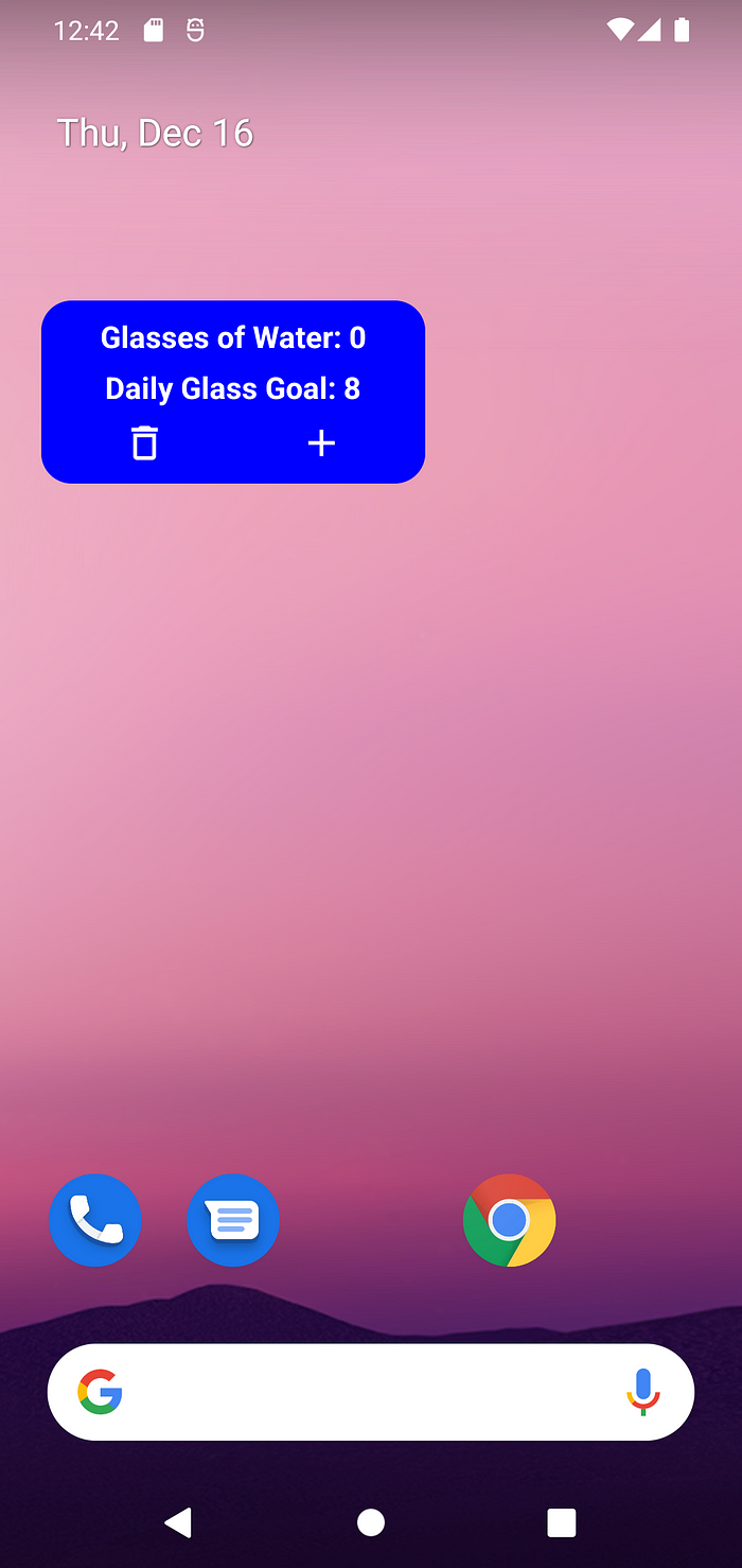
As an introduction to utilizing Glance, a simple app widget will be designed to keep track of how many glasses of water a user has drank in a day. The Github repository can be found here.

Initial Setup
To begin creating the app widget, some preliminary steps will need to be performed.
Glance is compatible with the latest stable version of Android Studio, so it will need to be updated accordingly.
As for the project, several gradle dependencies will be required.
Since Glance is based on the compose framework, several compose dependencies are required along with Glance itself. Additionally, compose will need to be enabled for the project.
Since Glance is only available as a SNAPSHOT, which are builds periodically generated in the androidx.dev repository, this will need to be included in settings.gradle:
Declaring and Previewing the Widget
Prior to writing any composables, the widget must be declared in the android manifest with additional defining information.
Widget Info
Glance widgets, just like non-composable widgets, require an xml definition for their attributes.
In the project, a new resource directory can be created named xml, which will contain it. Within xml a new file, water_widget_info.xml will be made.
The appwidget-provider provides android with attributes about the widget.
- The widget name (In this case
WaterWidget) - Its minimum sizing information in DP
- How the widget can be resized by the user
- The default size of the widget, which is new in Android 12, this is automatically set as 2x2 but can be scaled from 2x1 to 4x3
- The category, which defines the type of widget; this can be Home Screen, KeyGuard, or Search Box

With this basic information, this xml info can now be included in the manifest.
Android Manifest
To properly declare the widget, a receiver will need to be written in the Android Manifest.
As a preliminary step, some boilerplate code will be written to create receiver and widget classes.
First, a file will be created called WaterWidget.kt, which will house both of these components.
The WaterWidgetReceiver extends the GlanceAppWidgetReceiver which acts as a provider for the widget.
This provided widget, WaterWidget , contains a composable function Content() that will contain the widget layout.
Once these classes are defined, the receiver can be added to the manifest.
namewill utilize the previously created receiver class:WaterWidgetReceiver- The intent filter is declared to receive updates to the widget
- The metadata will use the previously defined attributes in
water_widget_info.xml
Initial and Preview Layout
As a final step to this initial process, an initial and preview layout will need to be defined in order for the widget to function properly.
Unfortunately, these layouts will need to be written in xml, as to compose is not yet supported here. Since this part of the code is still based on RemoteView, one of the supported xml layouts will be required:
- FrameLayout
- LinearLayout
- RelativeLayout
- GridLayout
ConstraintLayout will not work for the widget’s initial or preview layout.
The initial layout is a legacy item that contained the layout for a widget declared in xml.
For now, the documentation for Glance explains that an initial layout is required, but this will be removed in the future. As such, a simple frame layout will act as a placeholder until this can be removed with upcoming updates to Glance.
The preview layout will display a preview of the widget when the user selects it from the widgets menu and drags it onto the home screen.
This preview is built to mimic what the widget will look like when built in Compose. These can be added to the attributes in water_widget_info.xml:
Note: Prior to Android 12, previews use the android:previewImage attribute and use an image instead of xml to display the preview. For backward compatibility use this method as well.
Hopefully, as Glance is updated, it will remove the need to create any of these xml components, as it is counterintuitive to create both an xml and a compose layout.
Creating the Widget Layout
With all of this in place, it’s time to write some composables for the widget. The widget itself is simple, it will contain four major components:
- Text showing a counter for how many glasses of water the user has drank
- Text showing the daily recommended number of glasses
- A button for adding a glass to the counter
- A button for resetting the counter
Writing Composable Content
A separate file can be created called WaterWidgetContent.kt, which is where the composable functions will reside.
Note: since these are Glance composables, the components used will be from the Glance framework, not from standard compose. As such, they will use GlanceModifier rather than Modifier to modify their behavior.
Starting with the counter text, this function will retrieve a formatted string and pass it the number of glasses drank as an argument.
This formatted string takes a number type (in this case an Int), to display the user’s progress. Notice these Composables are provided by Glance, not by the usual Androidx library. These UI components and the Glance Modifier behave very similarly to their Androidx counterparts.
Next, the goal text will contain logic to choose a string depending on whether the user has reached the goal or not.
The constant RECOMMENDED_DAILY_GLASSES can be defined back in WaterWidget.kt in a companion object.
Now, the buttons for adding to and resetting the counter can be declared. First, vector assets for each of the images will need to be added in the drawable res package.
For adding to the counter a plus asset will be used, while the counter reset will use a “garbage can” asset. These images can be declared inside a Row to align them horizontally.
In order to write the on-click handling, a Glance ActionCallback must be created for each of the two buttons.
ActionCallbacks
The Glance ActionCallbacks are exactly what they imply; they perform an action when notified.
In a new file called WaterWidgetActions, two classes can be created which will extend ActionCallbacks .
These functions make use of the suspend function of the parent class onRun(); when the callback is invoked, the logic in onRun() will be performed.
These callbacks can be attached to their corresponding image buttons using actionRunCallback<T>() in conjunction with clickable(…) .
However, before implementing the actual logic in either of these callbacks, state handling must be examined.
Using State in Glance
For the widget to properly keep track of how many times the user has incremented the counter, it will need to keep track of a state; this can be done with components provided by Glance.
Back in the AddWaterClickAction , the onRun() function can be modified:
Here, the suspend function updateAppWidgetState(…) provides a scope to access and edit a data store.
In this case, since PreferencesGlanceStateDefinition was passed as a parameter, android’s DataStore is used. Values from DataStore can be retrieved using an appropriate Preferences.Key depending on the expected return value type. In this case (for the number of glasses of water), an intPreferencesKey is used.
Once retrieved, the function compares the stored number of glasses to a defined upper bound (999 was used in this case just to prevent the user from incrementing the counter limitlessly), and adds one to the value if it does not exceed the boundaries. Once this operation is performed, WaterWidget().update(context, glanceId) is called to update the widget state with new data.
The constants for WATER_WIDGET_PREFS_KEY and MAX_GLASSES can be defined in the companion object for the WaterWidget class:
For the ClearWaterClickAction the logic is simpler:
Similar to the other callback, this one accesses the same stored value for number of glasses. However, this function sets the stored value to zero, resetting the users daily progress.
With these values properly stored, they can be accessed from the state within the widget itself.
Putting it all Together
In WaterWidgetContent.kt a composable function can be created to encapsulate each of the individual components of the widget, as well as expose the context and the state to each of them.
Here, Glance uses LocalContext.current to provide the widget context to each composable, while stateDefinition is overriden to provide the state. Since DataStore was used previously to store the values in the callbacks, PreferencesGlanceStateDefinition is used again to access them. Now, currentState<Preferences>() can be used within the composable function to retrieve the necessary data. Just like before, the number of glasses a user has drank today can be retrieved using the WATER_WIDGET_PREFS_KEY and passed to each of the text components.
As mentioned before, the GlanceAppWidget contains a composable Content() function, which is where this composable function can be called. With the layout complete, the functioning widget can be added to the home screen!

As Glance is still only in its early stages, this code will be subject to change, but hopefully, this early look can help with what is to come!

